<aside> 👉🏼 This is a 2 part article. Read the other part here: Rethinking Google Translate - Chap 1/2
</aside>
Side projects are teachers, of sorts. After trying to redesign the Google Translate app and failing, Sahil and I tried again. Only while writing about it did we realize we weren’t failing, but making real good progress. We learned to not trust the first iterations of the designs we made and to never give up until we’ve solved what we had first set out to solve.
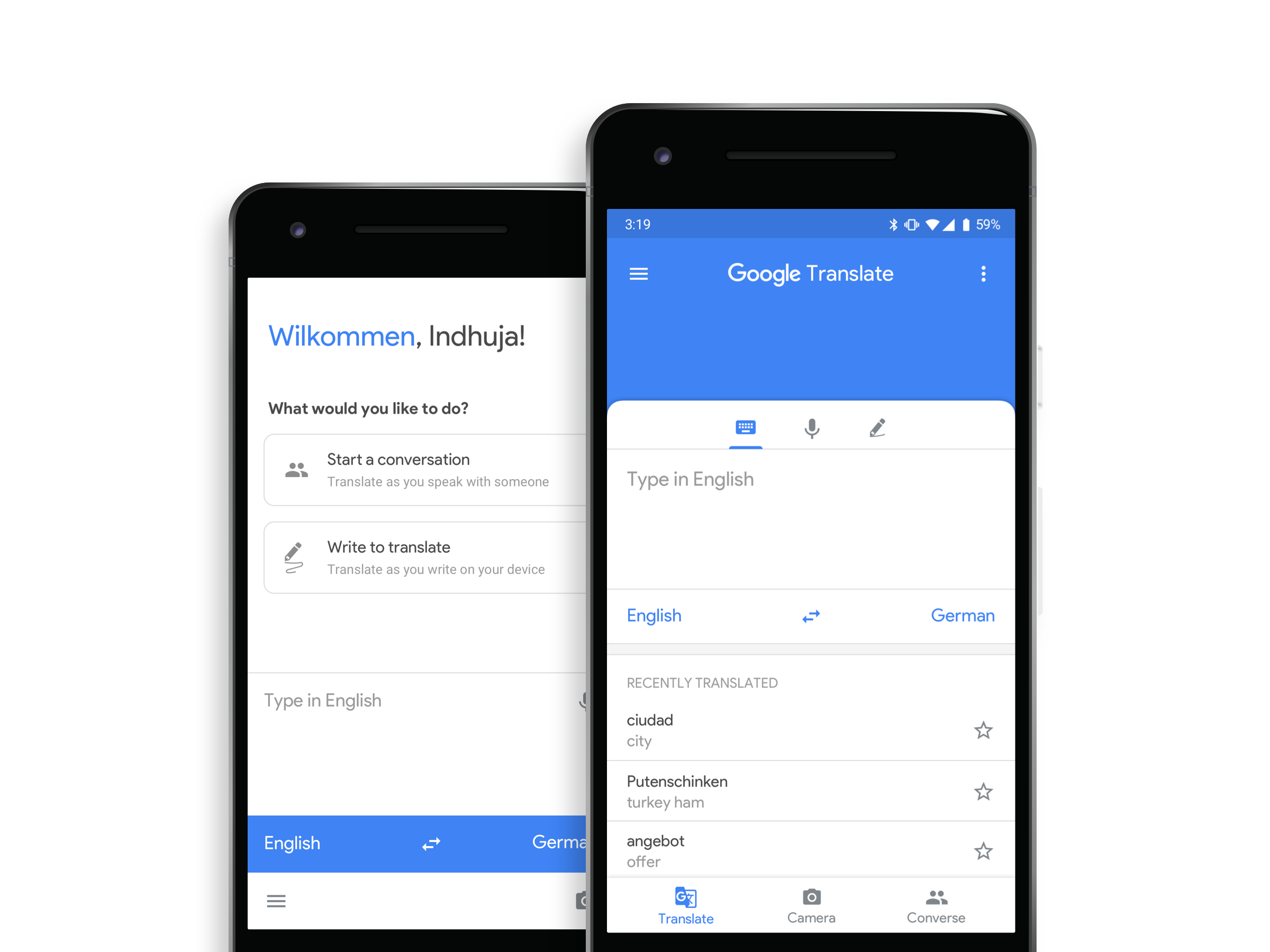
Proposed design for Google Translate. First and second iterations.
Redesigning products that are already great is a very exciting challenge I seem to have taken up since the Gmail redesign.
And well, Google Translate just turned out to be even more exciting.
Google Translate has been nothing less than a blessing since my move to Berlin. Having used it extensively for over 6 months now, I’ve had a few issues as a user and a designer. In the process of rethinking Google Translate, we tried making something that looks new and majorly solves one problem — Reachability.
Here’s a first iteration we came up with -

Google Translate’s current home (vs) Our 1st iteration
People responded positively to the reachability problem, so we knew we got that right. The UI was fresh and all that, but it wasn’t really solving anything. And getting to the first problem led us to solve a few more on the way.
The app is constrained in a few ways in comparison to the desktop version, and for good reason. The app does what it says it does and has a very light and comfortable feel to it. And that’s how apps are supposed to make you feel. But for reasons unknown, the structure or the information hierarchy in the current home screen feels amorphous. That became clear once we had structured the information architecture (IA) in hand.
The primary actions on the home screen include- Type, Camera, Handwriting, Conversation, and Voice. These are the five ways Google allows you to translate, via the app.
Of these, the type, handwriting, and the voice options use the textbox element primarily. The Camera and Conversation options do not use the textbox as directly as the other 3 options.